While many businesses hire either in-house or contracted graphic designers to fulfill all their poster designing needs, there remains a third option that many don’t consider because they feel they have neither the creativity nor the technical skills to complete it.
Designing a poster yourself may at first seem like a daunting task, but with the help of the following tips, these concerns shouldn’t continue to hold you back.
Posters almost always have a hierarchy that impacts the order in which viewers receive information, the feelings they associate with that information and the lasting effect that information will have on them.
The hierarchy of a poster’s information can be developed through a varying number of elements of design depending on who you ask, but we've highlighted a general set of three that we think are the most important to remember in poster design.
These are the usage of lines, weight and typography.
While these three elements can be easy to confuse, here are the key things to remember about each of them and how they relate to guiding your poster’s viewers through your information.
Lines
Put simply, a line is a mark, either visible or implied, that connects two points. These marks can be perfectly straight to zig-zagged to curved and more.
Lines can be used to accent or emphasize certain words or paragraphs, or they can be used to draw the viewers' attention in a certain direction in the real world (like “Head this Way” types of posters printed on a hand with the index finger pointing to the right).
A collection of lines can form a pattern which can then have even more of an effect on how viewers interact with your poster. For example, geometric patterns that repeat the same configuration of lines over and over again can create a sense of structure and order, whereas curvy, unpredictable patterns can be disorienting for some viewers.
Patterns can also provide a sense of texture, which can add sensory intrigue that draws attention when displayed.
Another important thing to remember is that lines don’t necessarily have to be drawn. They can just as easily be implied by how you place and arrange elements in your poster's design.
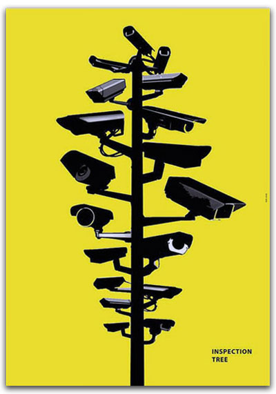 In the poster example to the left, lines are used to direct readers through a visual idea and then land them on the title “Inspection Tree.”
This poster design is also very direct in its usage of lines. It makes the poster have a much larger impact since the reader doesn’t have to spend much time or energy reading lots of information.
The three central points which guide the reader through this poster are the top of the “tree” of surveillance cameras, the bottom of that “tree” and the words in the lower right. These three points, only two of which are directly connected by a visible mark, make up the visual and informational direction of the poster and the viewers’ experience.
Weight
The visual “weight” of certain elements in a design isn’t actually measurable like how some objects are in pounds or tons.
Rather, visual weight is relative and functions similarly to lines as it affects the order in which readers receive information and the direction the eye is drawn when it first views an image. Creating weight can be accomplished by a multitude of operations when designing a poster, but the key ones to remember are color, proximity and balance.
Colors that are darker like black and navy-blue bear more visual weight than other ones like white or light blue. Darker colors draw the viewers’ eyes in as if they were actually objects with a gravitational pull.
Proximity, or its inverse “space” can be manipulated by intentionally controlling the distance that you leave between drawn objects on paper. For example, if you were drawing a crowd of people, the weight would be heaviest in whichever part had the most people in it. On the outside of the crowd, space (either white or whatever other color you could use for a background) would ultimately have to increase to represent the edge of a crowd. Where it’s less “busy” in an image is where there is a greater amount of space and therefore less visual weight.
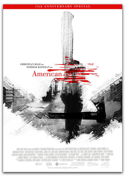 For example, this poster for “American Psycho” bears the most weight in the word “Psycho.”
Even though it’s written in white typeface, it uses elements of weight to draw the reader’s attention to that word. The space immediately around the word “Psycho” is very busy and it has a lot of action created through lines and colors. This part of the poster has a lot of edges between colors, creating the chopped up and busy feeling that gives it so much weight and visual intrigue.
Red is also a color that instinctually draws attention and is commonly associated with blood, aggression and passion.
Generally speaking, when a person looks at an image that has red in it, it’s likely the very first thing they’ll notice or that their eyes will be drawn to.
In this way, this part of the poster bears the most weight, and understandably so since the central figure of the entire film is, in fact, a psycho.
Typography
Typography sets a tone that affects the state in which your poster’s viewers will read the words.
In general, typography means the arrangement and selection of typefaces (or fonts) for the purpose of making the text in a design more legible and appealing.
Sometimes, as in the “American Psycho” poster above, the typefaces are intentionally different and spaced in an uneven fashion to create a disharmonious typographic effect that visually represents the genre of horror, confusion or fear. Typography can also evoke a certain genre and the feelings and memories one may associate with that genre.
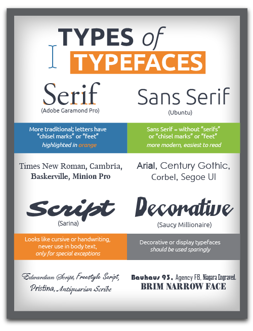 If you’ve ever used a Microsoft Office product, you have probably come to know the fonts (or typefaces) Times New Roman or Papyrus or Comic Sans. For various reasons, we’d advise against using those fonts in formal publications like poster designs.
Times New Roman, while widely accepted as a professional and appropriate typeface for bodies of text, emails or memos, is not going to look professional when enlarged and positioned as a title on your poster.
Generally, this is because using very accessible font families like these will cause your poster to look like something created in a paint-like software. In regard to Comic Sans and Papyrus: these typefaces are some of the few that have become clichés that are widely considered tacky and humorous.
Picking a typeface that will work involves a lot of thinking, comparing and experimentation. The trick is to go off the beaten path to find clean, modern typefaces that are going to be legible given the sizing and spacing you want them to be in on your poster.
Google Fonts is a great library to start with since it features over 800 professional-grade typefaces that are open source, meaning you can use them for any application without worrying about stepping on font foundry copyright
Keep in mind that certain texts that are appropriate for titles may not be appropriate for the body text of certain posters, and vice versa.
A good free tool to use for pairing typefaces is Font Pair. This service lists aesthetically pleasing font pairings using Google Fonts exclusively. This is great if you’re planning on using a Google font in your design, but isn’t so helpful if you’ve already got some specialized ones already picked out.
If that's the case, searching through the hundreds of open source fonts Google offers to find a font family that closely resembles your favorite shouldn't be too hard, and from there you can find a suggested pairing that will likely also go well with your selected font.
Google fonts are almost universally available to anyone with an internet connection and they are all downloadable, making them fully accessible for use in poster design.
The large selection of typefaces in this collection allows you to try out fonts you may be unfamiliar with so you can add intrigue to your poster designs through diverse font pairings.
Another massive source of free fonts is dafont.com. They have tens of thousands of fonts to choose from in practically every possible font category.
So, try out some new fonts, use some you never would have thought of using before. Some of the ones you’ve avoided in the past may look extremely different and be the right fit for your new poster’s design.
Getting Started
To get started, check out and download some of our poster template files for various poster sizes, listed below. These files come preset with the correct dimensions, bleeds, margins and trims necessary for printing posters of their specified size.
Armed with these key tips, you should now be prepared to create posters that demonstrate a strong understanding of lines, weight and typography. Keeping these concepts in mind and experimenting with them could end up saving you a lot on hiring graphic designers in the future.
Once you've finalized your poster design, submit an order for prints or get more info about our poster printing products using the link below.
Order Poster Prints Now
