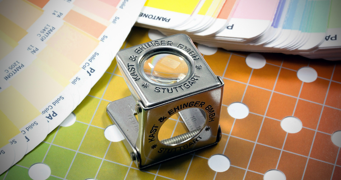
When it comes to understanding the difference between RGB and CMYK you need to understand the difference between colors on a digital medium and a printed medium. It will help to first think of these two different methods by which colors are created or mixed on each.
TL;DR Takeaways
- RGB is an additive color system because RGB light is added to make colors
- CMYK is a subtractive color system because light absorbing inks make colors by blocking certain wavelengths (colors) of light
- RGB is for digital screens and CMYK is for print
- Color is extremely subjective as colors can't truly be "measured"
- Some commercial presses like Conquest Graphics use G7 as a color “tuning” system to guarantee presses stay consistent
- Always design in CMYK first, then RGB if you're designing for print and web
- Be sure to color convert your own files before submitting them to your commercial printer to have full control over printing colors
To understand how colors can mix, we first need to understand what color really is. Colors are visual perceptions. They don’t truly exist in the universe as defined values; rather they are entirely subjective and are highly influenced by contextual elements and relative perception. Essentially, color is what we see when different qualities of light are being reflected off an element.
For example, incandescent light bulbs create a warm reddish, yellowish light by converting electrical energy into heat energy in a filament that then emits varying wavelengths of light, generally on the higher wavelength side of the spectrum (which coincidently includes mostly reds, oranges, and yellows).
In fluorescent lights, electrical energy runs through a gas filled tube, causing the gas inside to emit light as the energy flows. Neon lights and standard office place lights are typically fluorescent lights, as they’re more energy efficient and produce brighter, cooler-toned colors of light.
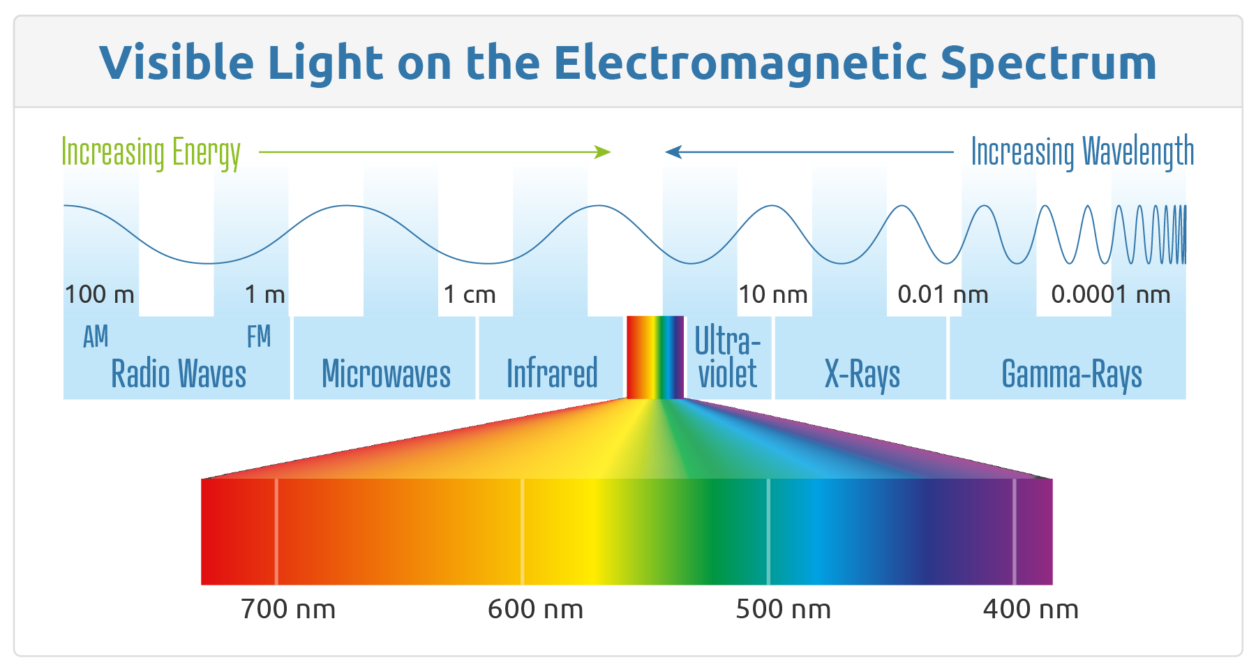
If we remember that visible light comes from both sources that are (1) either reflecting or filtering light from other sources or (2) sources that are actually creating light energy themselves, we should be able to make a clear distinction between CMYK and RGB color systems.
What is RGB Color Mode?
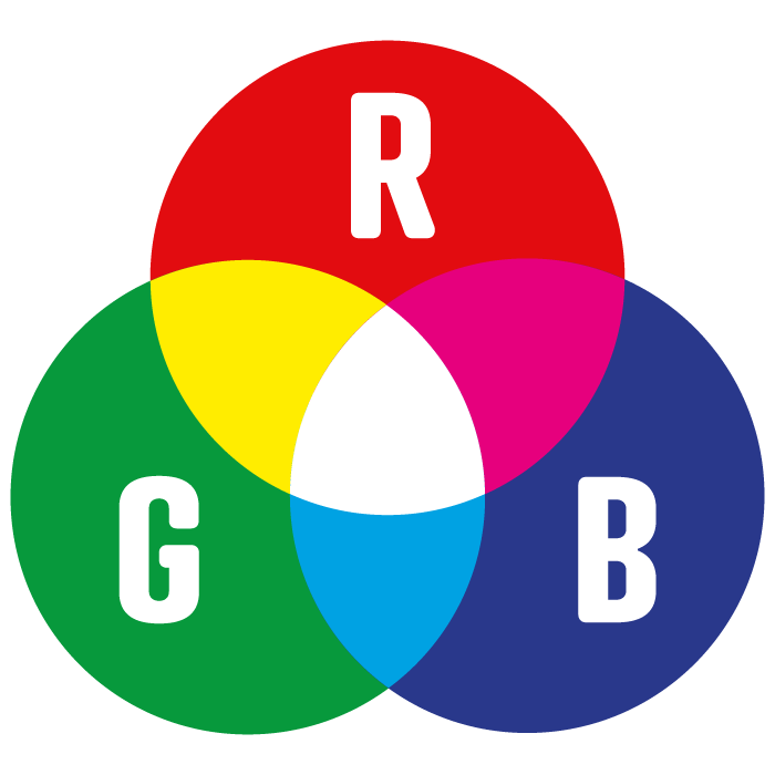
RGB (Red, Green, and Blue) uses three base colors to form almost every color imaginable. Red, green, and blue are all additive colors. This means that RGB color mode creates different colors by adding different quantities of these three primary colors which is called additive color mixing. RGB is typically associated with computer monitors, TVs, cameras, cellphones, and scanners. RGB is also used by most photo editors or design platforms, which is where things can become difficult when printing.
How Additive (RGB) Color Systems Work
An additive color system represents the sources of light (and therefore color) that create light energy themselves. These media create three main colors of light, red, green, and blue, which are then added together to create a much larger range of colors. These three colors, when added together at full intensity, make white. As mentioned above, digital media emits color as RGB.
To illustrate how digital screens produce light, it’s helpful to think of what a monitor or TV screen looks like before you turn it on. When a monitor is off, it isn’t releasing any light and appears dark gray or black, typically. There aren’t any colors being created by the screen which results in the screen’s version of pure black (RGB 0, 0, 0). But to render a color on a screen, all you must do is turn it on.
 When you turn on an additive color medium like a digital screen, you’re allowing electricity to flow to certain parts of the screen so they can selectively run varying amounts of electricity through light emitting diodes (LEDs) that produce either red, green or blue light.
RGB can be overlapped and illuminated at different intensities to produce a very wide range (or gamut) of color. The colors are therefore said to be “additive” since the screens must use electricity to produce (or add) varying intensities of red, green and blue light to get closer to its white point.
To understand the concept of additive color systems in a more concrete way, imagine you have three spotlights that are each producing one of three colors: red, blue or green. Now imagine moving the spotlights so they’re overlapping like a triple Venn Diagram. What you would see, so long as you’re using pure red, pure blue and pure green light, would be the outer part with the original RGB spots, and then overlapping between the green and blue, you’d see cyan; between the blue and red, magenta; and between the red and green, yellow.
In the center where all the colors overlapped, you’d see a section of pure white. This is, in principle, the exact same way the screen you are reading this blog on is working right now.
On digital media like tablet screens, computer monitors, or cellphone screens, the spectrum of colors possible (also called the color “gamut” of the screen) is dependent upon an additive process of creating color. It is only through the adding of light of different wavelengths alongside one another that other wavelengths of light that resemble other colors are created.
In the case of RGB color systems, white can be generated by running the red, green, and blue lights as high as possible (RGB 255, 255, 255), side by side, so white (which is unfiltered light at all wavelengths) is what shows through. To achieve black in this color system, a screen need only to be "turned off” or RGB set to 0, 0, 0.
What is CMYK Color Mode?
CMYK uses subtractive colors and represents Cyan, Magenta, Yellow, and Key (known as “black.”) When adding CMYK colors together, the more you add, the darker the color will appear. This color mode is typically used by printing companies.
How Subtractive (CMYK) Color Systems Work
While additive color systems work by producing more light of red, blue or green wavelengths to a given medium, subtractive color systems work by doing pretty much the complete opposite.
By subtracting the number of various wavelengths of light that reflect off a white surface, a blank piece of paper, for example, subtractive color systems can control the colors that appear on a printed medium. By using inks that have specific color absorbing or reflecting properties, a commercial printer is able to manipulate the wavelengths of visible light that are reflected off the paper so that the printed piece has colors that are as close to those of the digital version as possible.
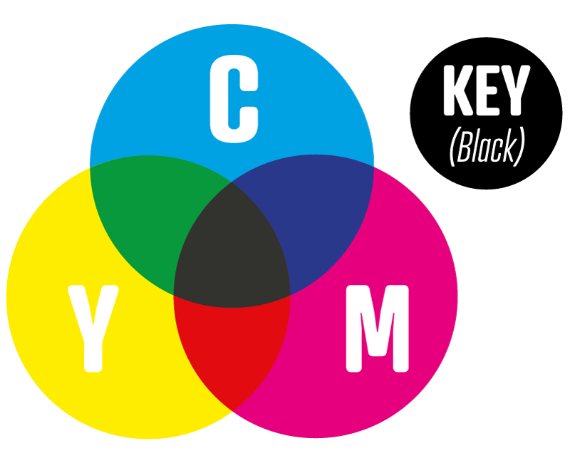 As mentioned, subtractive color systems use cyan, magenta, yellow and a “key color” (black) to produce a wider gamut of colors. Compared to the colors possible with an additive RGB color system, the subtractive CMYK model is a little more limited, although it is capable of producing some colors that would be otherwise impossible with just an RGB system.
Different color inks absorb and reflect specific wavelengths of light to produce the color that is visible.
The CMYK color model is called the subtractive color model because the more ink you add, the closer to black you get (CMYK 0 0 0 100). This means the inverse is also true: in order to get to white (CMYK 0 0 0 0), you need to subtract more ink so the natural white point of the printed piece can only be as white as that of the page it’s printed on.
No matter what color model you choose to use when editing and designing a printed piece, the final piece will be converted to CMYK for printing.
When it comes to converting, your printer will do their best to make sure the colors are as close to matching as your digital files, but it’s better if you, the designer or someone else on your team make the color conversion yourself so you can correct any colors that may have ended up looking “off” after the conversion.
Some desktop printers for offices and homes prefer to use RGB files due to the built-in color conversion capabilities they have.
While this is the case in rare instances with consumer-oriented printers, this is not a common preference among commercial printers. For our clients to get the colors and print quality they want, they need to first make sure the CMYK version of their files is to their liking.
RGB vs CMYK Color Gamuts
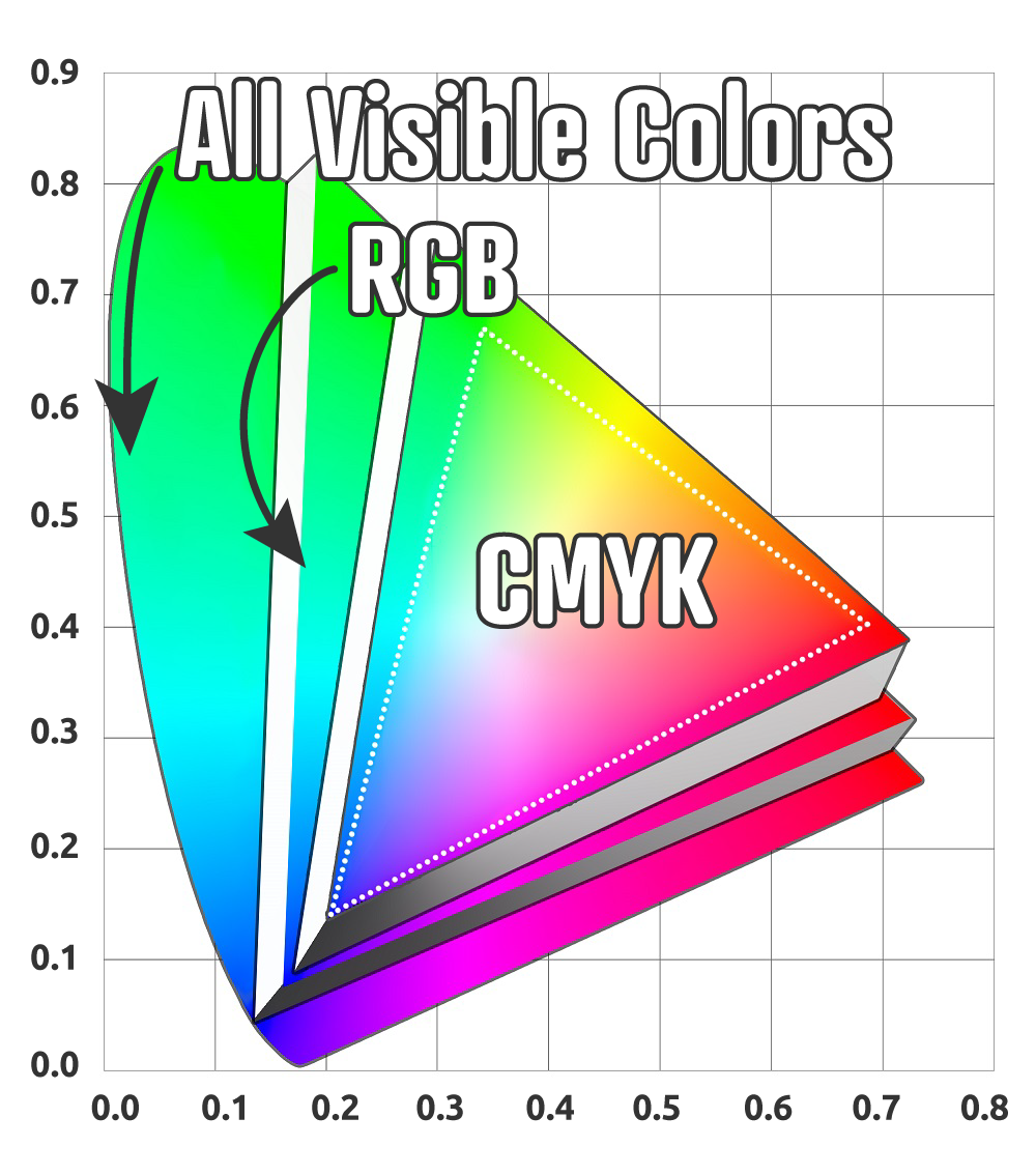 All color models can only display a limited gamut (range) of colors compared to the actual visible spectrum of color. RGB has a wider gamut than CMYK, which means that not all RGB colors can be reproduced in CMYK (i.e. not all colors on screen can be reproduced in printed ink).
The difference in gamut is most noticeable when dealing with very bright, vibrant colors. The neon colors you can get on a computer monitor cannot be reproduced when printing with normal CMYK ink on paper, because while digital media emits light, ink on paper does not.
For this reason, we advise any designer working on files that will be for both digital and print use should start their design in the CMYK color space first and convert to RGB later. This will prevent the designer from having to spend extra time hunting for colors that aren’t exactly possible in CMYK.
How Do I Know Which Color Mode to Use?
Designers often use design platforms like Photoshop, InDesign, or Illustrator. These platforms, by default, use the RGB color mode as they are often used to create digital work like digital graphics, digital ads, and website images and designs. However, these platforms are also commonly used to design printed materials. This can become a problem if not addressed because when an RGB design is printed via a CMYK printing process, the colors can appear differently if not converted. So, how do you know which color mode to use?
- When designing digital mediums, like digital advertisements, you’ll want to use RGB.
- When designing for print, you’ll want to use CMYK.
How Do I Color Correct?
Exact Color Matching Between CMYK and RGB Color Systems
When it comes to matching a printed color perfectly with one that’s visible on your computer monitor or phone screen, there are going to be the natural limitations outlined above that prevent all color values possible with RGB from being possible with CMYK.
If it’s absolutely essential for your brand’s colors to be consistent across all media, there are a few ways you can achieve this.

First, when using a design platform, like InDesign, Illustrator, or Photoshop, correcting color is simple. Click on ‘View’ in the top menu, then select ‘Proof Colors.’ Your design platform will then show you a preview of the design converted to CMYK. You’ll likely notice a few changes in appearance, but this is flexible. For example, if your blue appears different, you can use a ‘Selective Color’ adjustment layer to remove some of the magenta and replace it with cyan and black.
Second, and a more accurate process, it’s possible to use a spot (or Pantone Matching System) color in place of a process CMYK color. These colors are specially ordered, pre-mixed inks that are prepared by Pantone to ensure a particular color will always be consistent across all print jobs. Using a spot (or PMS) color on your project will impose some hefty additional fees due to the costs of added time and having to specially order a particular Pantone color.
If you would rather not break the bank over ordering a PMS color, or are using a different design platform, you can always add a contract proof along with your order instead of just the standard digital (PDF) proof we send standard. What a contract proof adds for your job is the ability to receive a finished printed version of your project before completing your order.
This mockup of your project will allow you to make sure our process colors match the colors you were looking for before signing and committing to the order.
It’s sometimes a good idea to get contract proof with your first job from any new printer you haven’t worked with before. However, because contract proofs are not free and with advancements in color matching capabilities for PDFs, digital proofs are still recommended. If you have any concerns, you can always reach out to your printer’s design team to make sure all colors are exactly how you need them.
Commercial Printers with Quality Color Specifications
At Conquest Graphics, we use the G7 color specification to fine-tune the colors our presses are actually printing on a daily basis. This kind of tuning allows our presses to consistently produce industry-leading quality print all day, every day with the best color matching possible.
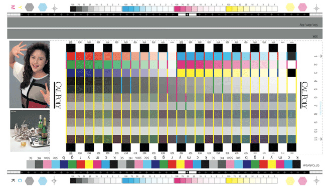 Each day, Conquest Graphics uses a special color-detecting optical device to quantify the color values of sample pieces from our press. This kind of technology ensures our colors are consistent day in and day out and that we are always delivering the quality and service our customers deserve.
All of this information about color may seem overwhelming at first, but at Conquest Graphics, we like to reassure our customers it’s something they don’t have to get in the weeds about to be successful while printing with us. As a commercial printer, one of the biggest parts of our job is to pay attention to all these color details and the fine-tuned elements of a printed piece that gives it that finalized, professionally printed quality that is unmistakable from the moment you get it in your hands.
Many online printers don’t go to such extreme lengths to make sure their presses are as well maintained and color calibrated, so we at Conquest Graphics are proud of our collective effort to deliver the very best quality print to our customers in record-breaking, industry-leading turnaround times.
If you are interested in printing with us, click below to explore all options we have available for you. Or if you are still unsure of what color mode is best for your project, or if you are unsure on how to check which mode you are working in, feel free to reach out to one of our team members through our LiveChat pop up and we would be happy to assist you!
Explore More Today!


