Before you go!
× CloseWait! before you go would you like one of our amazing paper sample guides?
Please add your reason below.
Wait! We've Got Free Stuff for You...
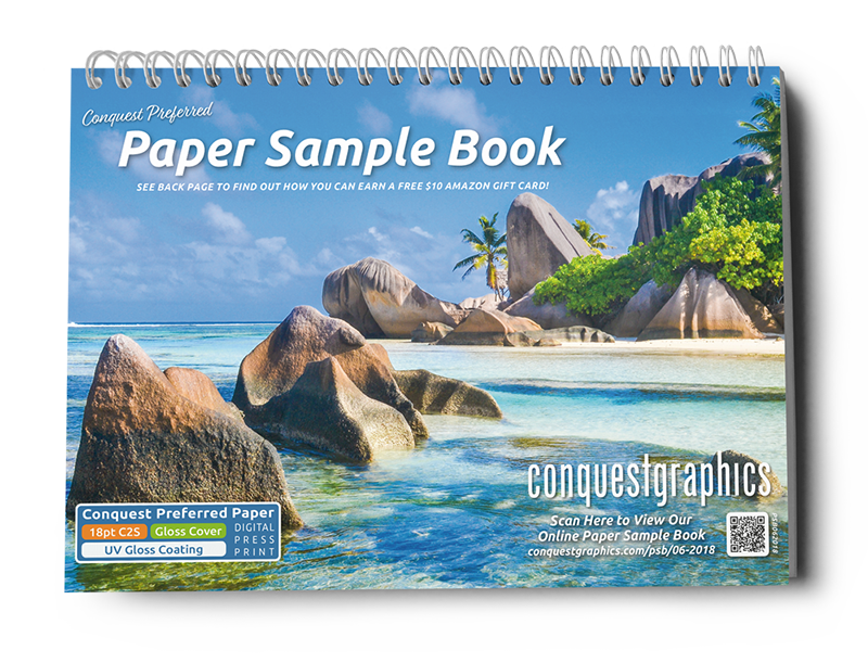
Use the request form to the right to get a free Paper Sample Book mailed (for FREE) to your desired address.
Request Received
Thank you! Your request has been received, and we will send your Paper Sample Book out to you shortly!
If you have any questions or concerns in the meantime, please don't hesitate to reach out to our customer service team by emailing CustomerService@ConquestGraphics.com or calling 800-707-9903.
Get Inspired to Create Great Direct Mail!
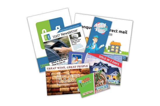
Use the request form to the right to get a free Direct Mail Idea Pack mailed (for FREE) to your desired address.
Request Received
Thank you for your interest in our Direct Mail Idea Pack. We will get this comprehensive sample packet out to you shortly. If you have any questions or would like to place an order you can contact us at 1-800-707-9903 or by emailing Sales@ConquestGraphics.com.
What Can Print Marketing Do For You?
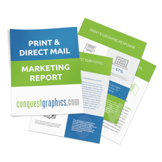
Use the request form to the right to get a link to download our free Print and Direct Mail Marketing Report ebook (for FREE) today.
Read Our Ultimate Guide to Buying Print!

Use the request form to the right to get a link to download a free ebook of the Ultimate Guide to Buying Print (for FREE) right now.


Let's keep in touch!
We also offer custom products, submit a quote request or chat now.
We are happy to work with you to find a solution that fits your budget. If you'd like us to reach out, provide your email address below.